Organizations worldwide are looking at migrating their legacy Flash course to HTML5 to support mobile learning. In this article, I outline what are your options and how you can maximize the impact of your migration budget.
Till a few years ago, Flash was pretty much the default authoring tool to offer online courses. As a result, organizations across the world have a significant investment in legacy courses based on Flash.
Today,
- Most browsers do not support Flash.
- Also, modern learners prefer the delivery of online training to support their mobile devices.
Since Flash does not support mobile devices, there is a need for you to plan the migration of your select legacy courses to HTML5.
Why An Investment On Migration Of Legacy Courses To HTML5 Is An Absolute Necessity?
This investment on migration of legacy courses to HTML5 is necessary to unlock your existing investment. Further gains associated with this exercise are:
- Online courses designed in HTML5 provide a multi–device experience wherein the learners can take the same course on the device of their choice ranging from smartphones to tablets as well as laptops or desktops.
- These online courses can be taken on the go, at the pace the learners wish to consume.
- The studies clearly show adoption of mobile learning or mLearning will be the new standard in online training.
- Furthermore, the learners are leaning away from adaptive design to fully–responsive design (that fits dynamically to a viewable area).
How Can You Optimally Design For Mobile Devices?
As you plan for the migration of legacy courses to mobile learning or you embark on creation of Responsive or Mobile-friendly eLearning, you can choose from two approaches:
Approach 1: Mobile–friendly designs
These reflect the more commonly available design approach (Adaptive learning) adopted to design mLearning courses. The designs feature multi–device support. However, they still map to the way learners use the laptops/desktops. This approach does extend seamlessly to tablets. However, in smartphones, this approach works only in the landscape mode. When viewed in the portrait mode, you will see a blank space as the design shrinks to a viewable area.
Although, the online courses work across all devices, it is important to note that the learner interactions in this approach are not necessarily aligned to the way we use our mobile devices.
Tip: One of the most popular authoring tool Articulate Storyline 3/360 creates an output in this category. Other two popular authoring tools are dominKnow Claro and iSpring.
Approach 2: Responsive or Mobile–first designs
In contrast, the Responsive or Mobile–first designs are optimized to run on the smartphones. This is then extended to tablets and laptops or desktops.
This approach not only features a completely responsive design approach (wherein the content adapts dynamically to a viewable area); its significant difference lies in the interactions that mimic the way we use our mobile devices.
Tip: There are two streams of authoring tools that you can use to create a Responsive or Mobile-friendly eLearning output in this category.
- Tier 1 (They use multi–device layout–based approach to design): Adobe Captivate 2017, Trivantis Lectora Inspire 17
- Tier 2 (They use rapid development approach based on the usage of their standard templates): Adapt Learning, Articulate Rise, CrossKnowledge Mohive, dominKnow Flow, Elucidat and Gomo and so on.
NOTE: You can also opt for Custom HTML5 frameworks that too offer true Responsive or Mobile-friendly eLearning designs.
Let me share a couple of examples to highlight the differences between the two approaches.
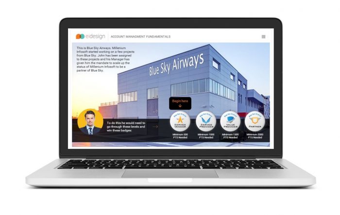
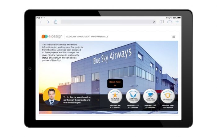
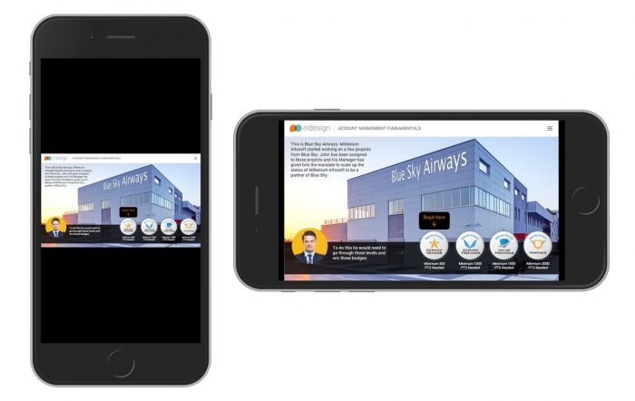
Example 1: Features a mobile-friendly design that would run seamlessly across smartphones, tablets, laptops and desktops.
However, as you will notice, the design shrinks in the portait mode of the smartphone.
Furthermore, the learning interactions are not necessarily optimized for mobile devices. Instead, they are designed to provide a multi-device support.
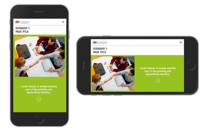
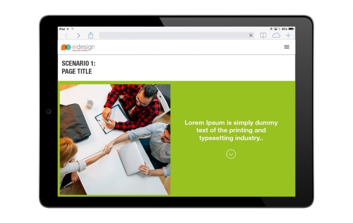
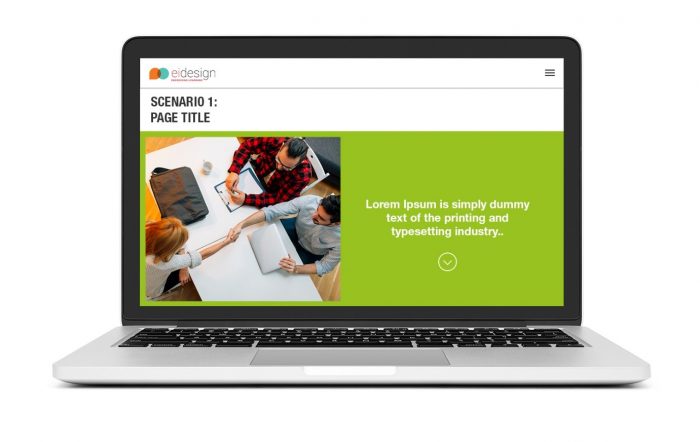
Example 2: In contrast, this example showcases optimization for the smartphones while retaining the support for other devices (including tablets, laptops and desktops).
Additionally, the interactions map closely to the way we use smartphones.
How Can You Leverage On The Migration Opportunity To Create Better And Higher Impact Learning Experiences?
The exercise of migration from Flash to HTML5 must not be about technology uplift alone (that is, converting Flash courses to merely open as HTML5 courses).
Instead, you can use this opportunity to redesign your courses that leverage the ways learners use their mobile devices. This approach will create a more engaging learning experience and create the desired impact (sticky learning) that you seek.
What Are The Techniques That You Can Use To Multiply The Impact?
You can use this opportunity in the following three ways:
Approach 1: Use techniques that engage and motivate learners better
- Gamification
- Microlearning: For both formal and informal learning
Approach 2: Use formats that are different from the more traditional ones
- Interactive videos (instead of videos)
- Animated videos (instead of long reams of text)
- Interactive infographics (instead of text or predictable interactions)
Approach 3: Go beyond formal training and engage the learner in a learning journey
- Learning Paths (featuring Personalization)
- Performance Support Tools
- Learning Portals that feature Social Learning and Participative learning (Curation)
Summary
The need to migrate your legacy Flash courses to HTML5 provides a great opportunity window to create Responsive or Mobile-friendly eLearning designs that will resonate better with your learners.
I hope this article provides the required cues on the techniques you can use during migration to HTML5 to create higher engagement, better completion rates and a more sticky learning experience. If you need any specific support or have any queries, do contact me at apandey@eidesign.net.
Need More?
Want more insights on how you can use to enhance the impact of your mobile learning for your corporate training?
Schedule a call with our Solutions Architecting Team.
Read More
- 4 Examples On How To Use Migration From Flash To HTML5 To Enhance The Impact Of Your eLearning
- Flash To HTML5 Migration – 7 Tips To Step Up The Learning Experience
- Best Practices to Migrate Legacy Flash Courses to HTML5 the Right Way
- Top 10 features of Adobe Captivate 2017 for Responsive eLearning development
- Top 10 Features Of Trivantis Lectora Inspire 17 For Responsive eLearning Development
- Free eBook: Flash To HTML5 Essential Toolkit For Successful Migration