Mobile Learning or (learning on the go) provides multi-device support. Slowly, there is a shift from offering this multi-device support that features a fixed layout (Mobile friendly or Adaptive eLearning designs) to a dynamic design (Mobile first or Responsive eLearning design) that automatically adapts to the viewable area of each device.
Take a look at this Infographic where we showcase 7 Examples of Responsive eLearning Designs – for Higher Engagement and Better Learning Experience. In each example, we have highlighted why we love this design.
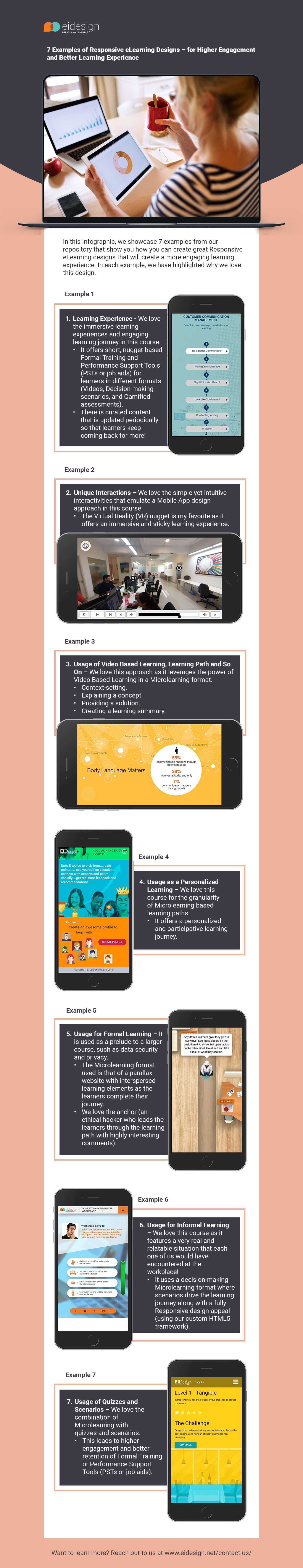
We hope this Infographic shows you how you can use the Responsive or Mobile first eLearning designs to create better engagement and higher impact trainings. Want to learn more? Reach out to us.